You've grown to 140 million tweets per day and impacted global politics. It's time you moved beyond the cartoon birdie. Here's three takes on a new Twitter logo.
Happy fifth birthday, Twitter! While five years seems like a blink of an eye, in the world of social media, you're a mature adult now. And you're ranked as one of the ten most visited websites worldwide by web traffic analyst Alexa. Your meteoric rise can be measured by comparing the measly 400,000 tweets per quarter in 2007 to today's average of over 140 million tweets per day--nothing to chirp at.
So it's way past the time for you to grow up as a brand. In other words, how about presenting a more appropriate image that reflects your current status? The following are just a few suggestions of how we think you should toast your fifth year as a media heavy.
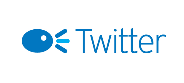
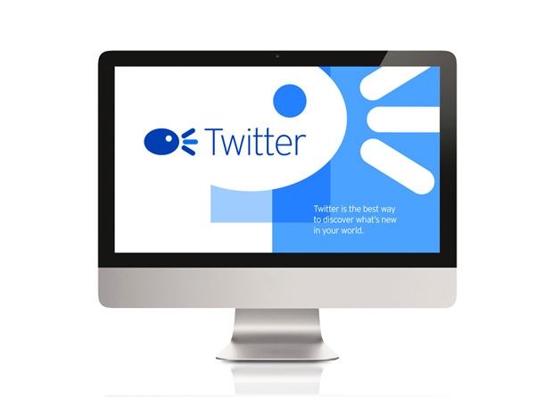
This streamlined execution of the current bird icon speaks to the simplicity and user-friendliness inherent in the brand's DNA. The short, straight "chirp" lines signify a quick and direct way to communicate within the 140-character limit that the brand personifies. In addition, the simplicity of this icon allows it to be universally accepted around the globe, thus helping with international expansion and adaptation.
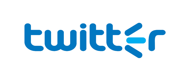
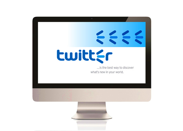
This incremental evolution of the wordmark preserves the brand equity of the logo but adds a new dimension of an animated "E," which is then transformed into the chirping icon. An added benefit is that it can act as a mnemonic device, becoming the hallmark of quick and easy communication--the equivalent of the Nike Swoosh for social media. When paired with a name or another logo, it can serve as an indicator of accessibility/Tweetability.
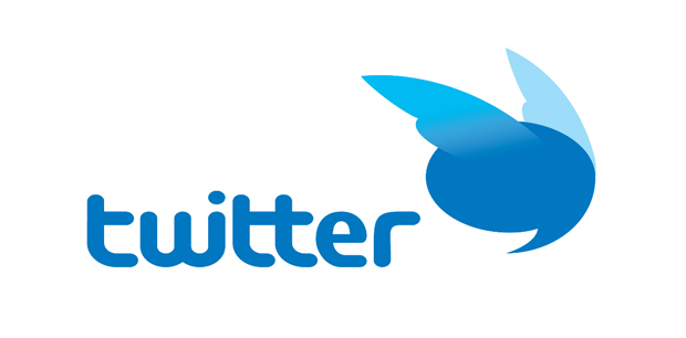
The amalgamation of the wings from the current bird (stylized to look more lifelike) and Twitter's famous thought bubble crystallizes the notion that Twitter is about communication, connection, and dialogue. This logo dispels the notion that Twitter is just about saying the first thing that pops into your head, and serves as a great mnemonic device for how Twitter takes your thoughts and shares them with your followers. The modified wordmark melds the "w" and "i" and connects the two "t"s for a streamlined mark that furthers the idea of touching and connecting.

Rick Barrack is the Chief Creative Officer/Partner at CBX and one of its founding partners. As lead creative he is responsible for inspiring, directing and motivating the creative teams to develop powerful design solutions. Barrack has close to 20 years of experience in corporate identity and consumer brand identity design. He has led major design initiatives for companies such as IBM, Hewlett Packard, Petro-Canada, ExxonMobil, Johnson & Johnson, and Del Monte Foods. Prior to creating CBX, Barrack was a Senior Design Director at FutureBrand and Design Director at LPK. [www.cbxblog.com]
Kelly Clarkson Natalie Portman Jessica Biel Christina Milian Kelly Brook
No comments:
Post a Comment